BRANDING • BROCHURE • PACKAGING
A New Name for the Flame
Sterling Oaks was developed under the BOND umbrella as a bold, standalone brand built for retail.
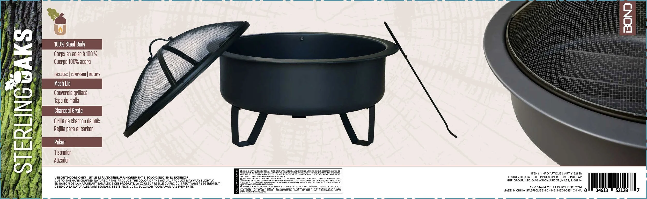
Created to house a line of wood-burning fire pits, the brand needed to feel strong, modern, and accessible, something that could hold its own on a Target shelf while elevating the everyday backyard experience. From the name to the visual identity, everything was designed to balance rugged durability with refined simplicity.

LOGO Full Color

LOGO one Color

icon

brand COLORS


MATCHES
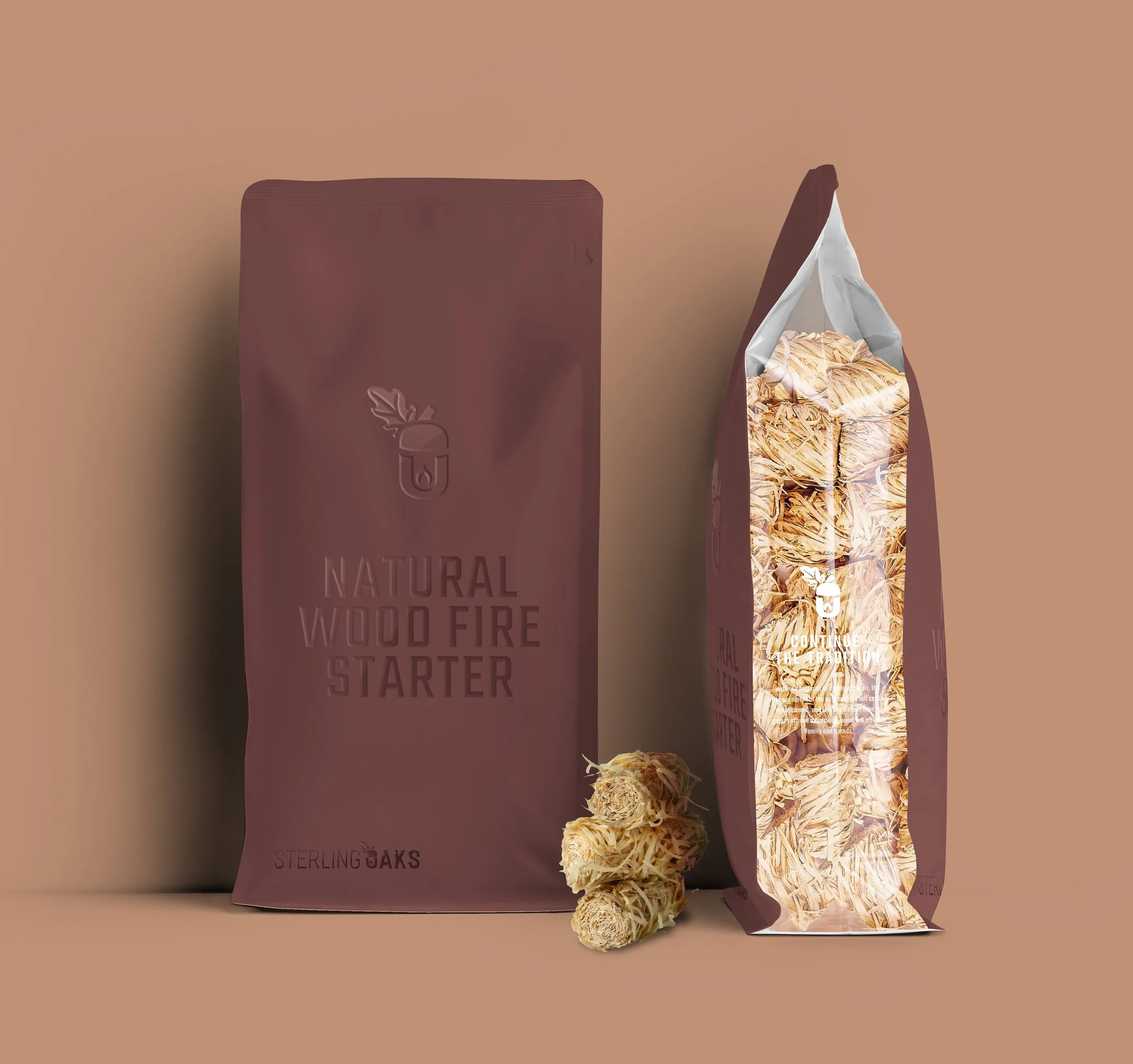
FIRE STARTER
ACCESSORY
PACKAGING

BROCHURE

PACKAGING
COLOR LABEL
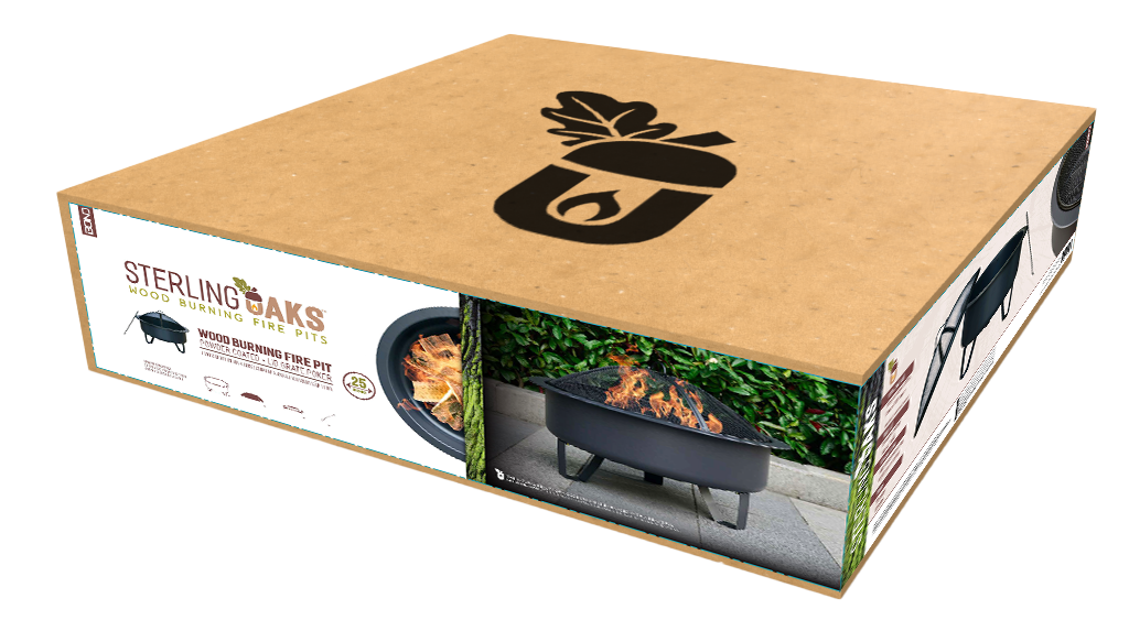
FLAT PACK